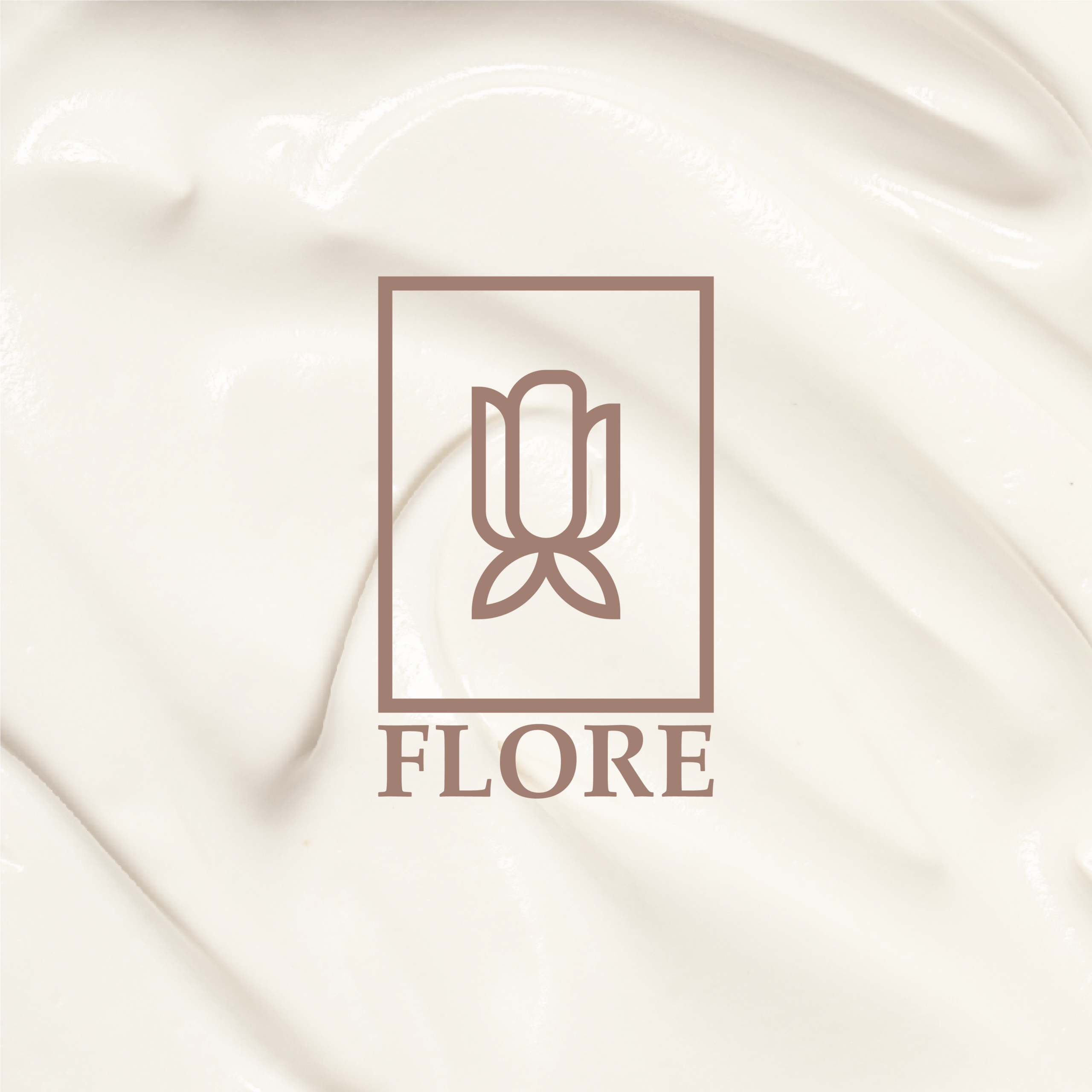
The Visual Anchor
The Flore logo was designed to radiate symmetry and balance. Combining a custom minimalist floral emblem with a refined serif typeface, the wordmark strikes a balance between natural grace and the high standards of luxury skincare.
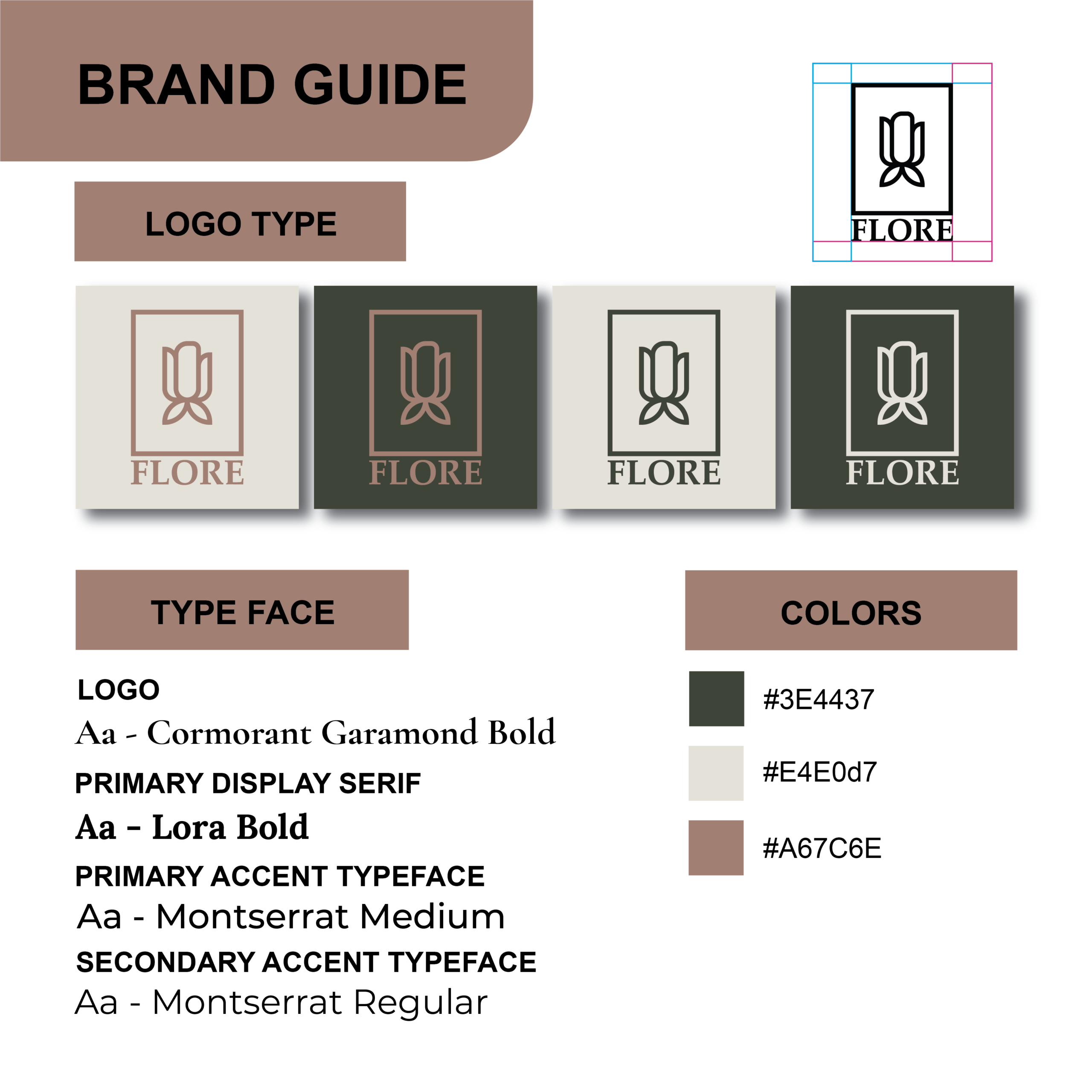
Natural Appeal
Branding for a premium skincare line requires a sense of purity and transparency. The identity utilizes a soft, earth-toned palette including sage green, warm sand, and terracotta, ensuring the brand feels approachable and grounded across all physical and digital touchpoints.
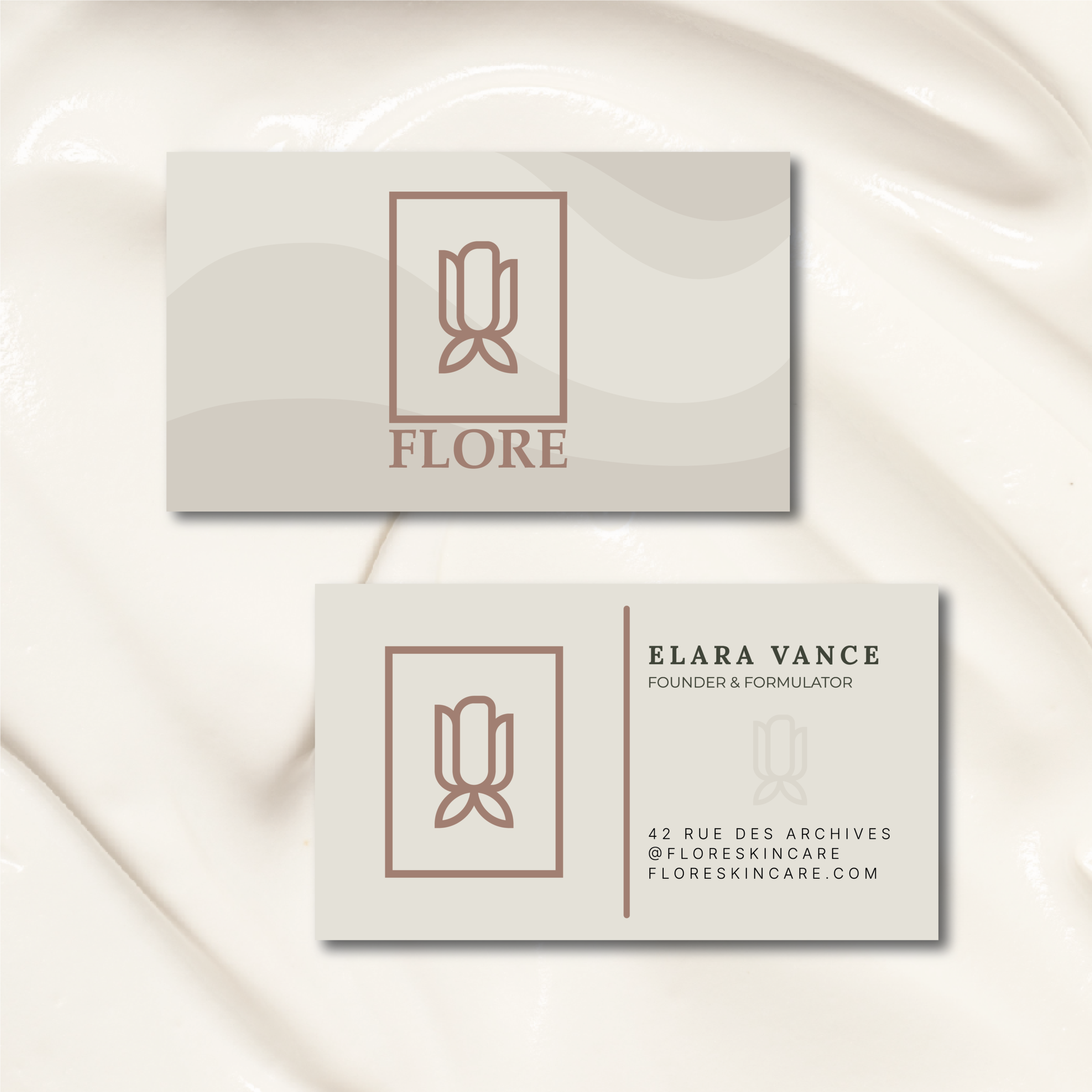
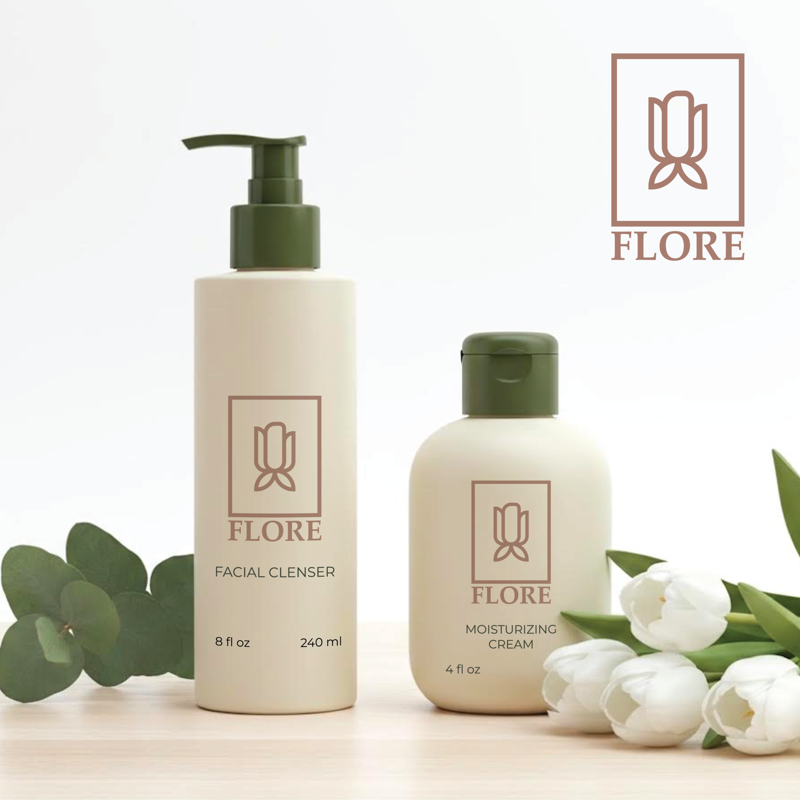
Lifestyle & Context
A skincare brand truly lives within the user’s personal sanctuary. I developed minimalist packaging mockups to visualize the identity on matte containers, ensuring that the typography remains legible and the aesthetic feels premium in a home environment.