Skip to content

LIAM'S BBQ RESTAURANT

Building a Modern Identity for Authentic Alabama Barbecue

THE VISUAL BLUEPRINT

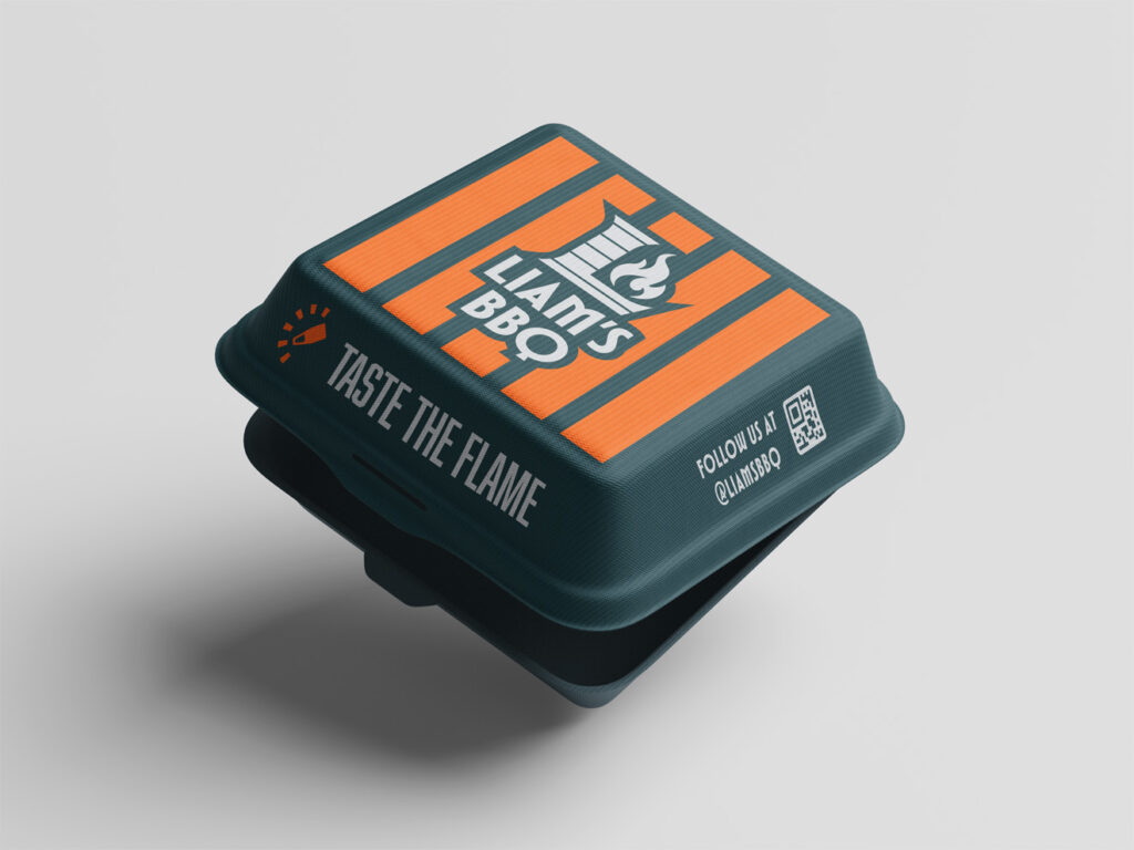
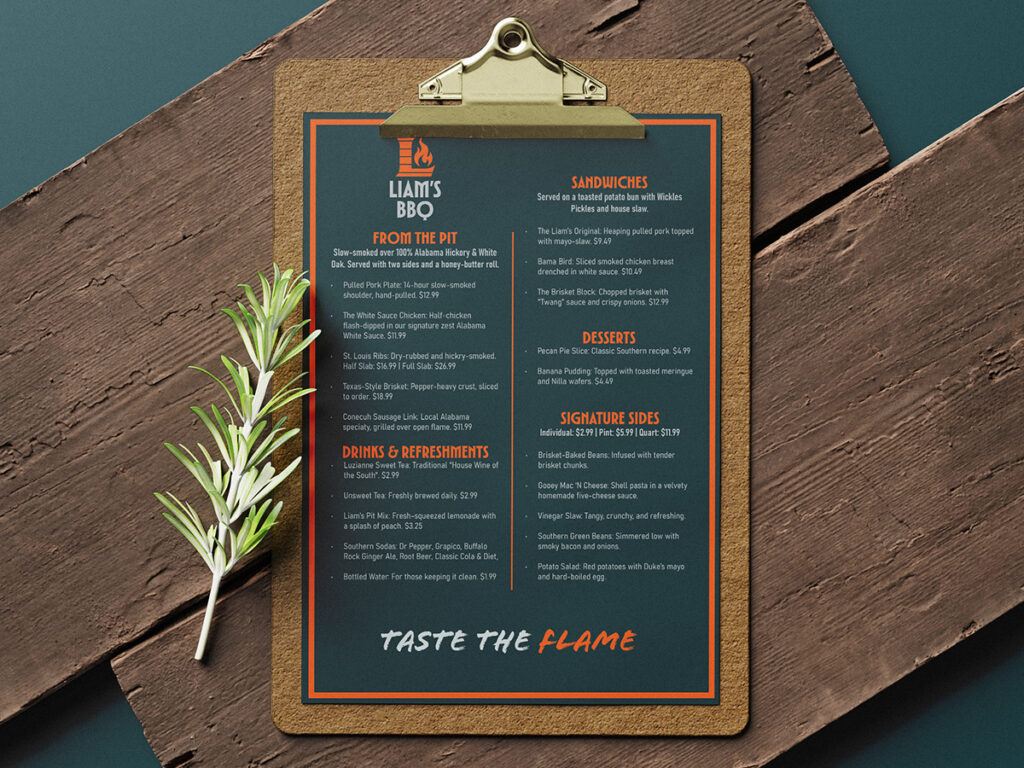
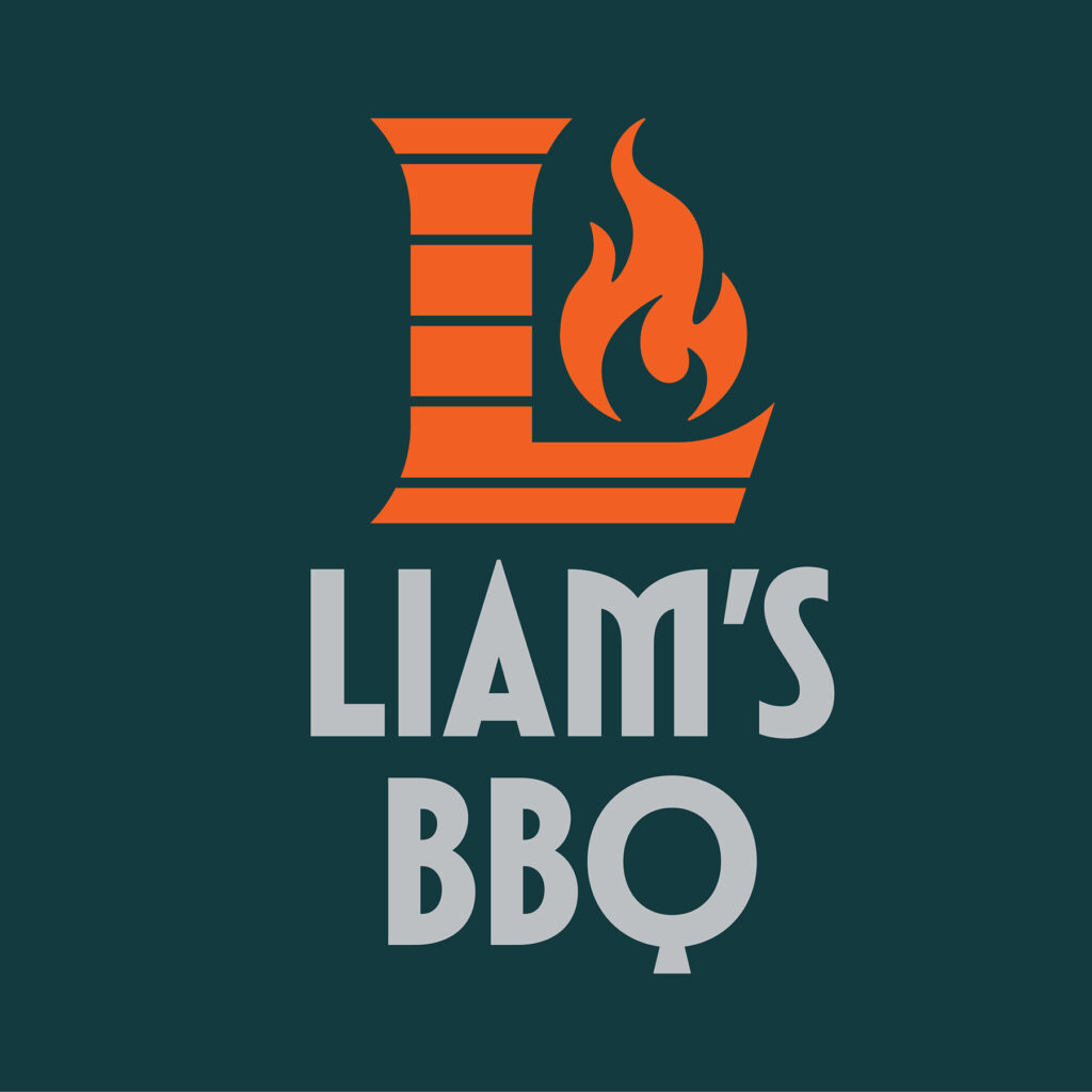
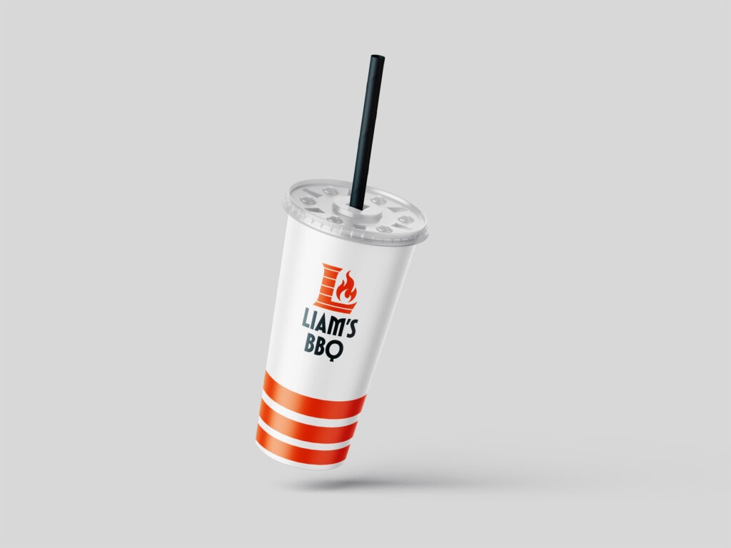
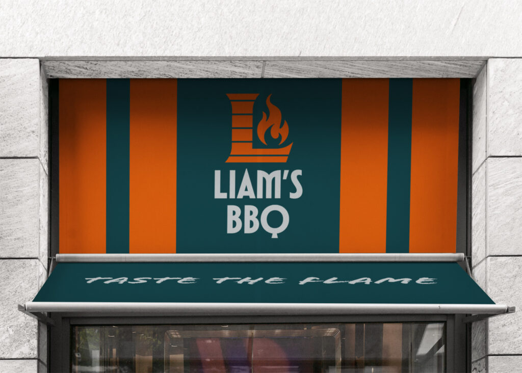
The brand identity for Liam’s BBQ is built on a foundation of Industrial Grit. Rather than leaning into tired BBQ clichés like wood textures or weathered pigs, we opted for a high-contrast, technical visual language. The primary palette of Charcoal and Flame Orange reflects the raw materials of the pit, carbon and fire. The core of the identity is the Grill Line motif, a series of geometric stripes that represent both the physical grill grates and a sense of modern efficiency. By combining a heavy, blocky slab-serif typeface with a minimalist flame icon, we created a brand that feels established enough to have a history, yet sharp enough to lead the next generation of Alabama smokehouses.

PACKAGING THE EXPERIENCE

A brand lives where the customer meets the product. For Liam’s BBQ, the identity moves from the digital space into the physical world through high-contrast packaging and architectural signage. By utilizing the Grill Line pattern as a recurring geometric motif across takeaway containers and awnings, we created a brand experience that feels as structured and engineered as the pitmaster’s process itself. Every touchpoint from the weighted feel of the menu to the ‘Taste the Flame’ seal on the box is designed to reinforce the premium, industrial nature of the Meridianville smokehouse.

FROM PIT TO PAGE

The final piece of Liam’s BBQ identity is the menu the literal roadmap to the smokehouse experience. To maintain the project’s industrial-chic aesthetic, the menu utilizes a high-contrast grid system that mirrors the technical precision of our earlier design phases. By anchoring the page with a deep charcoal background and using Flame Orange as a functional tool for hierarchy, we ensured that the most iconic dishes like the Texas-Style Brisket and Alabama White Sauce Chicken are instantly discoverable. The inclusion of the Grill Line motif as a horizontal divider serves as a subtle nod to the brand’s core visual DNA, while the heavy slab-serif typography provides a sense of rustic durability. This is where design meets utility, ensuring the brand feels as curated as the menu itself.