Skip to content

ARCANE & ANCHOR

Crafting a Fashion Brand of Modern Classic Legacy

Defining a Modern Classic

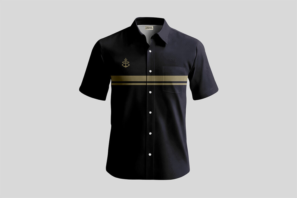
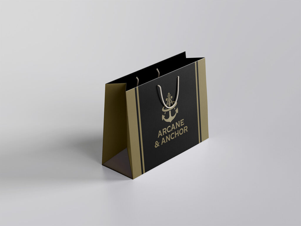
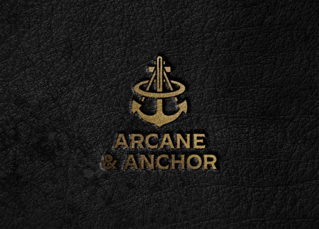
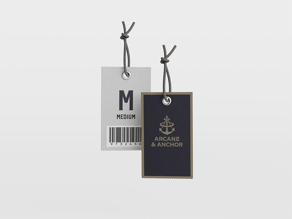
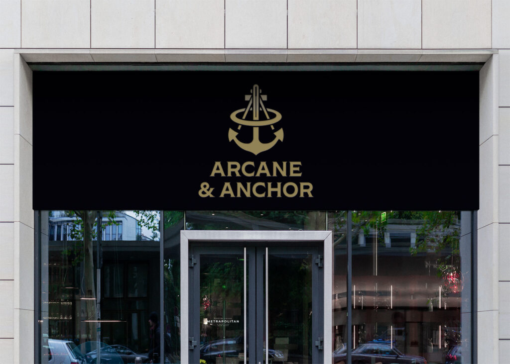
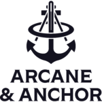
The identity for Arcane & Anchor is built on a foundation of technical elegance. Rather than leaning into distressed textures or seafaring clichés, we opted for a clean, gold-on-black palette that suggests a premium, engineered quality. The primary logo, a stylized anchor combined with a sextant, represents the brand’s core values: stability and craftsmanship. By pairing a blocky, authoritative sans-serif typeface with a minimalist emblem, we created a mark that feels equally at home on a custom-tailored shirt or a heavy-duty industrial shipping container.

FROM BRAND TO APPAREL

For Arcane & Anchor, the identity moves from the digital space into tactile reality through high-contrast apparel and sophisticated retail packaging. By utilizing horizontal gold banding reminiscent of nautical rank stripes across apparel and shopping bags, we created a recurring geometric motif that is instantly recognizable. Every touchpoint, from the hang-tags on a polo to the signage above the flagship store, is designed to reinforce the premium, structured nature of the brand. experience that feels as structured and engineered as the pitmaster’s process itself. Every touchpoint from the weighted feel of the menu to the ‘Taste the Flame’ seal on the box is designed to reinforce the premium, industrial nature of the Meridianville smokehouse.

BRAND MANIFESTATION

The final piece of the Arcane & Anchor identity is the brand manifest, the literal roadmap of the customer experience. To maintain the project’s high-end aesthetic, the layouts utilize a precise grid system that mirrors the technical accuracy of our earlier design phases. By anchoring the page with a deep charcoal-black background and using metallic gold as a functional tool for hierarchy, we ensured that information is not just read, but felt. The inclusion of the anchor emblem as a watermark and structural divider serves as a subtle nod to the brand’s DNA, ensuring that every piece of collateral feels as curated as the products themselves.